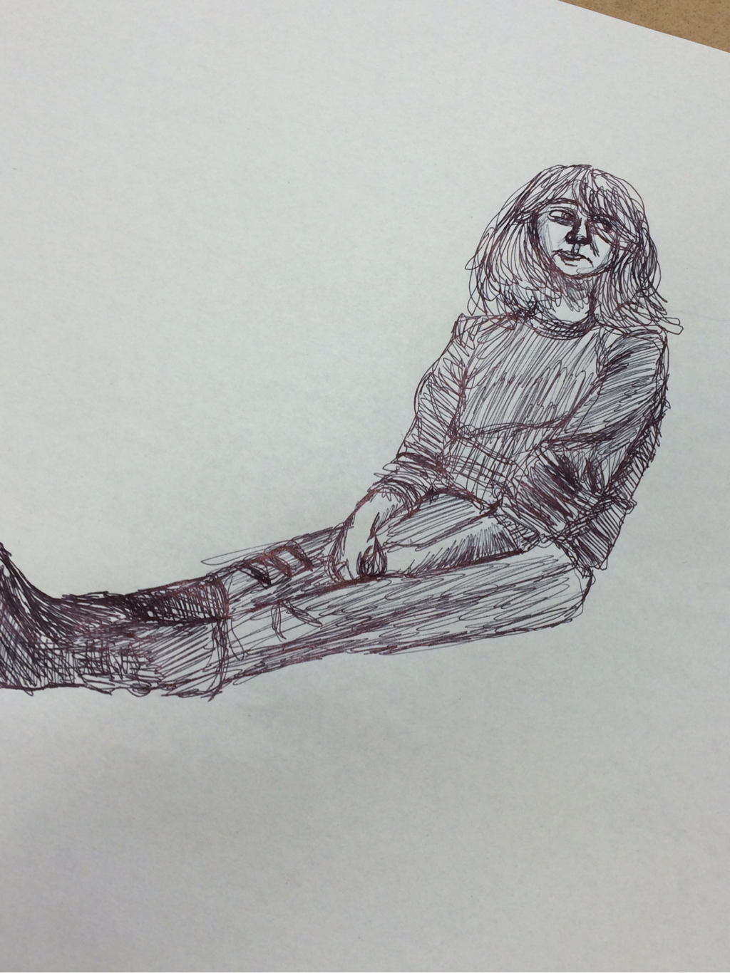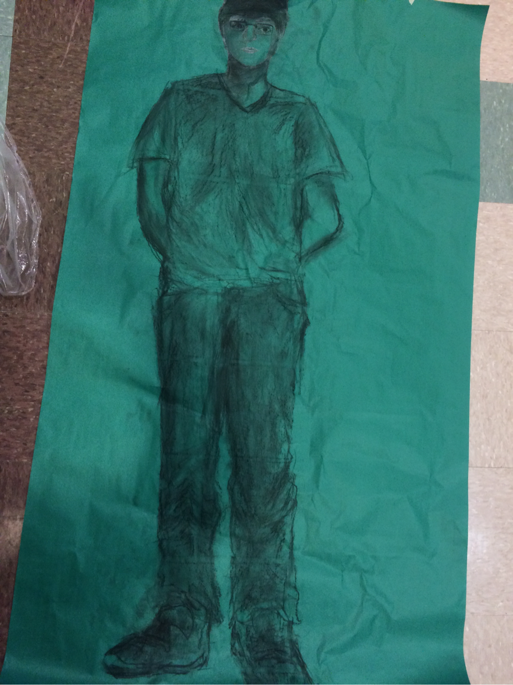
For this assignment we had to draw one of our classmates in a life-size figure drawing.
|
For this assignment we had to draw one of our classmates in a life-size figure drawing.
0 Comments
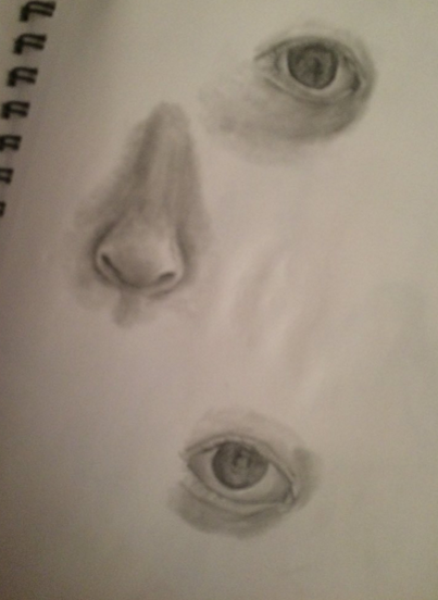
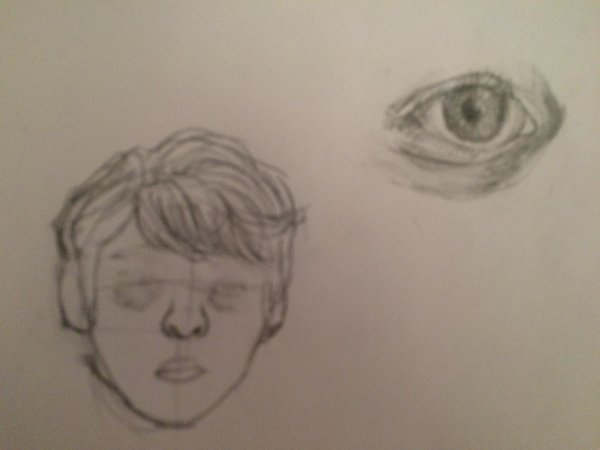
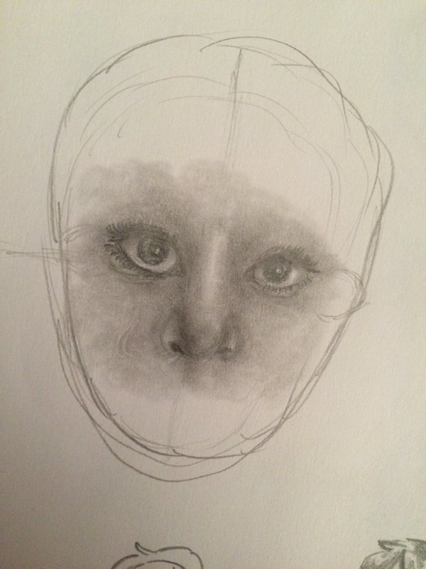
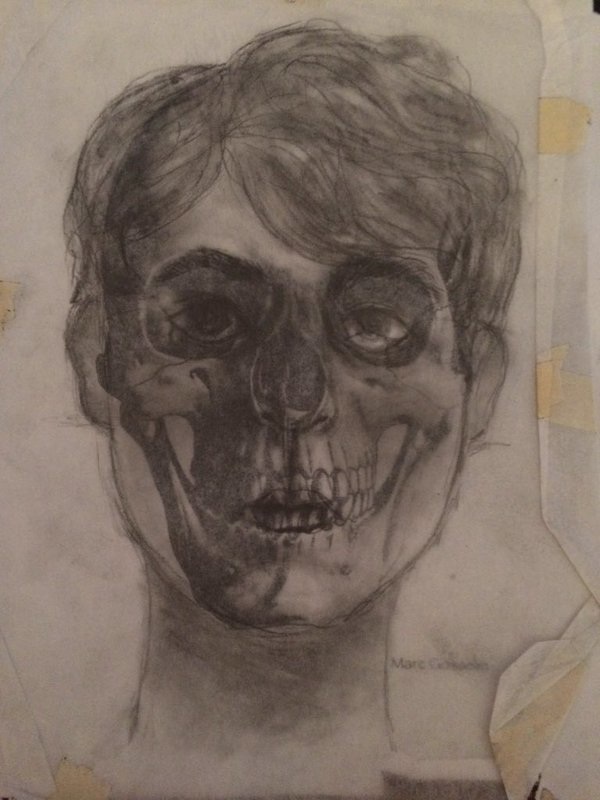
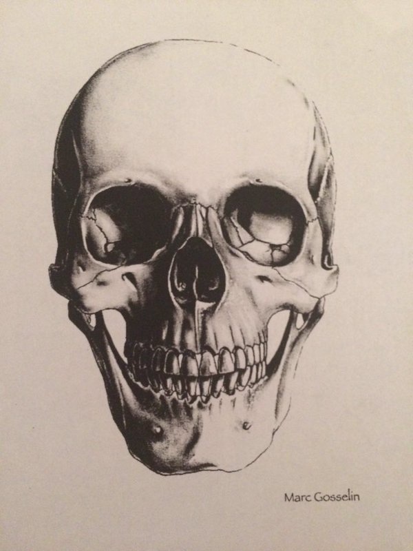
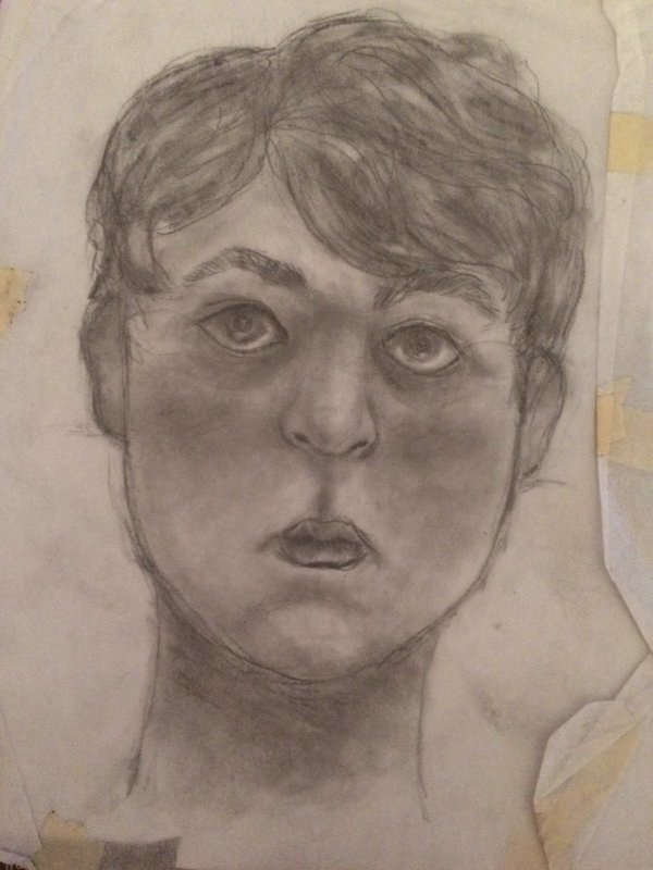
These are also all things from when we were working on portraits and facial features
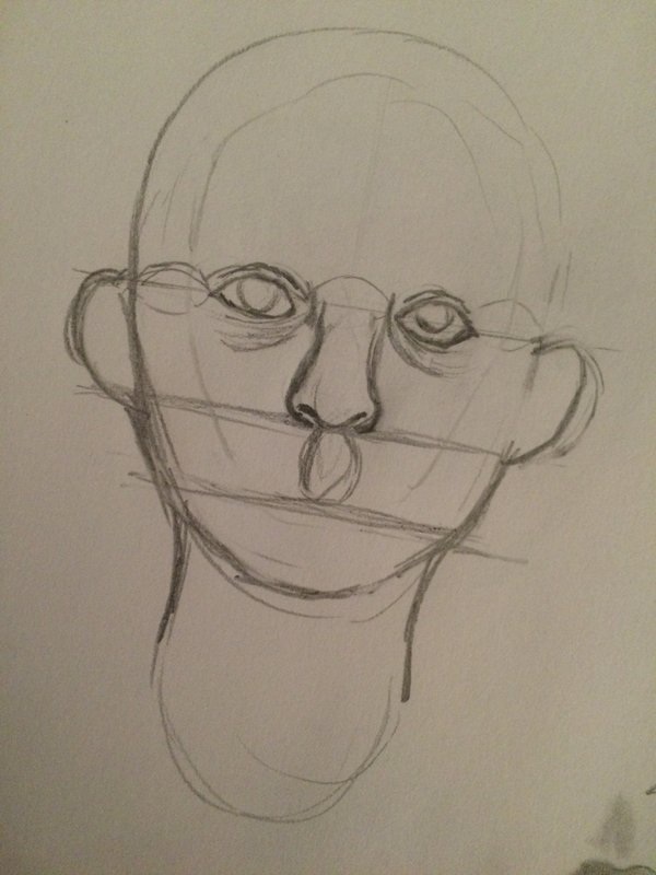
For this assignment back when we were practicing with drawing faces we had to draw our face on a piece of wax paper over a picture of a skull. I think it was supposed to help with the placement of the facial features while also giving us some inspiration for the portrait project in case we chose to do the zombie/monster theme.
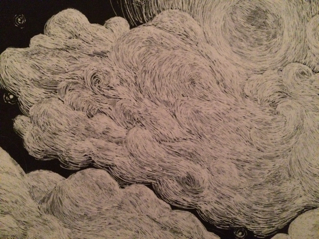
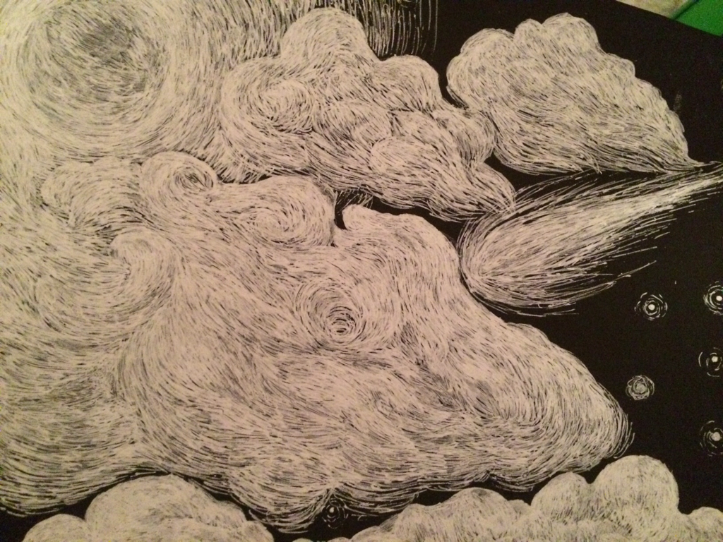
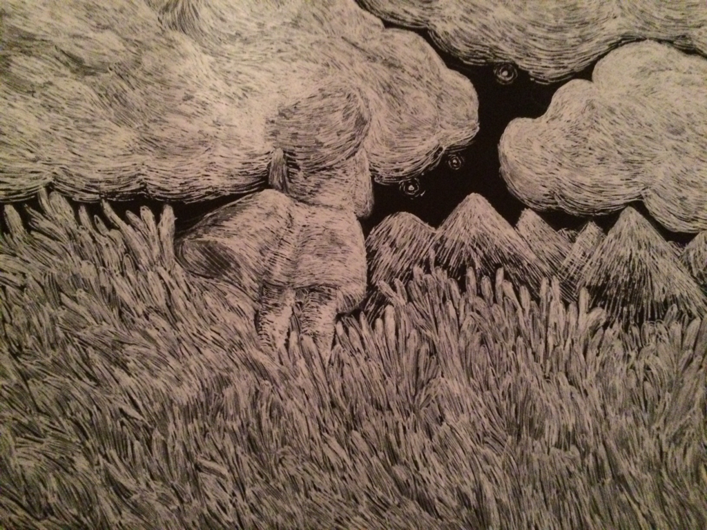
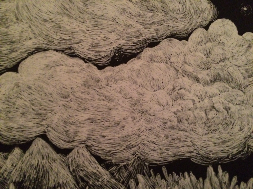
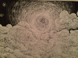
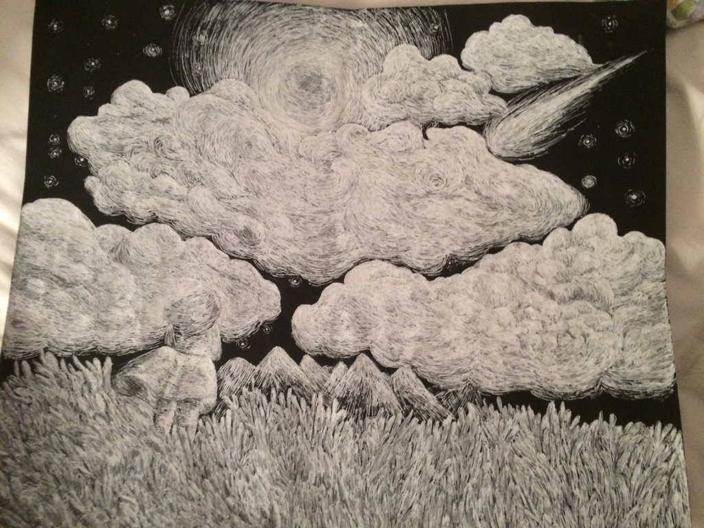 For this project we had to use scratchboards to create illustrations that showed movement and values. Since I have sensory problems and I can't stand the texture and the sound of scraping against the scratchboard I had to use a sheet of black construction paper and a white ink gel pen. I'm not entirely sure how I came up with the idea for this project. I think at first I wanted to do a comet/galaxy or something to do with space. I also wanted to draw clouds so I think that's how I ended up doing sort of a landscape-ish drawing. I got inspiration for the landscape from my uncle/grandfather's land when the grass gets really tall, and how you can see the stars better at night over there because there's not as much light. I ended up putting some mountains in the background to give the drawing a little bit of perspective. In this project I tried to display movement in the clouds and the comet, and I tried to show value by showing some light around the stars, moon, in the grass, and where the light hits the mountain. There are a few things about this piece that I don't like though; such as the over-use of light. In my opinion I wish I didn't overdo it with the gel pen, it just made the lighting look weird. I also wish I added more stars and maybe a few more mountains in the background as well. here's a few more close-up pictures
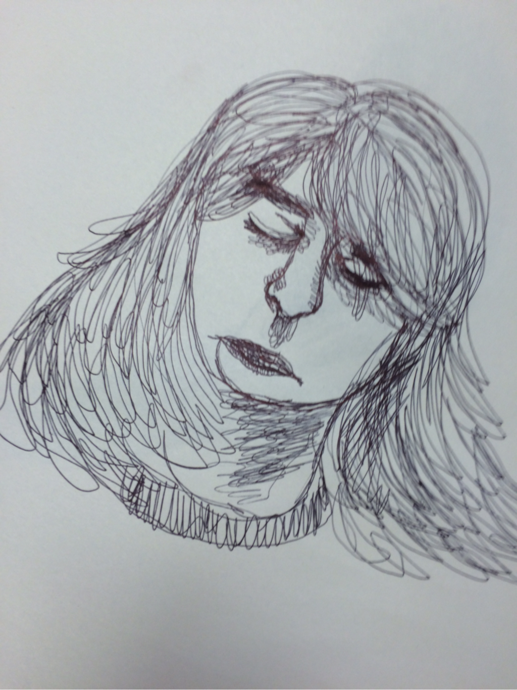
For this assignment we practiced figure drawing by doing a contour drawing of our classmates.
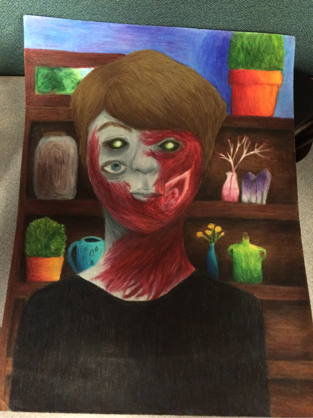 For this project we had to do a self portrait and choose between a mechanical, zombie, or expressive theme. I chose to do the zombie one because it sounded like a fun thing to do. In the original sketch for this I had intended to put four eyes on my self portrait, but I then realized I couldn't put a fourth one where I was going to put a ripped jaw. But even after I put in the ripped jaw it looked kind of boring because only a fourth of the face looked ripped up and zombie-like. When I was thinking about what else I could put on my portrait I thought about putting more ripped flesh on it and making it look like it was almost an infection spreading, so I went with that. Another thing I hadn't intended on doing was making the top pair of eyes look like they were glowing green, they were originally supposed to be just black and white to make the colors of the eyes look sort of inverted. The funny thing about why I changed it though was that I had the Danny Phantom theme song stuck in my head so I jokingly put in some green and tried to make it look like they were glowing and it actually worked out and I decided to keep it. The background was inspired off of my trips in the woods where I've been finding a lot of things like old glass bottles and jars, deer bones, even a bow from a bow and arrow. I was actually going to put in a deer skull but I decided not to because I felt like I already had too much to work on in this one piece alone. I also just really like plants and stuff. This piece was a lot of fun to color as well, especially my hair. I used a lot of prismacolors for it and I could finally use the metallic gold one. 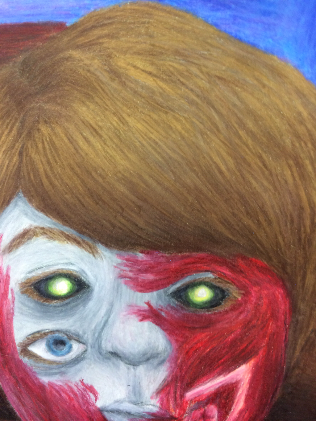 (a better picture showing More of the Use of the metalic gOld pencil)I really like how the metalic gold brought out more color and values in my hair. It actually makes it look more shiny in real life.
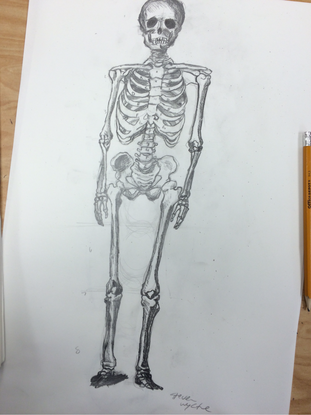 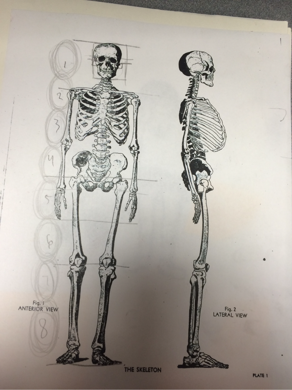 Yesterday we had to copy a drawing of a skeleton with shading. In order to scale it I was told that the body's height was equal to eight heads, I marked where some of the main parts were such as the head, shoulders, waist, the tips of the fingers, and the feet; then I tried to get an accurate measurement based on that. The toes were hard to draw for me because of the way they were printed on the reference sheet.
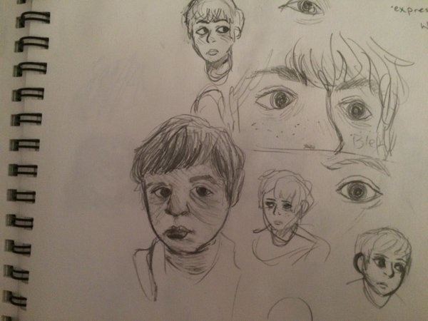
These sketches were used as I guess concept art for my final portrait project. For the project we have to choose to do either a zombie, mechanical, or expressive-themed self portrait. zombie/monster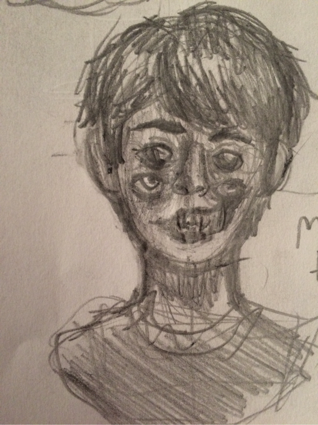 This is the sketch I went with for an idea for the final project. I was actually planning on calling this one "four eyes", but even with a ripped jaw in the design it was kind of boring and plain so i ended up making more changes to it in the final version. expressive I really didn't know what I would do for an expressive portrait so I just tried to redraw a selfie off of my phone from Halloween. (I was a party animal in case anyone wanted to know). mechanical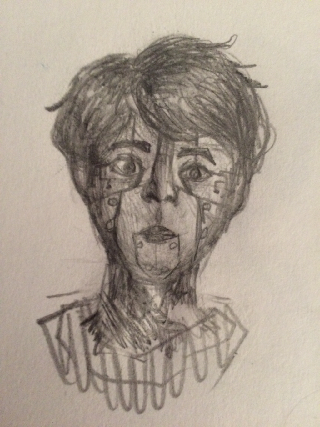 For the mechanical sketch i tried to make myself look like a robot or something like that. I actually thought about making my hair look synthetic but I didn't know if I would be able to pull that off or not so I decided not to do it.
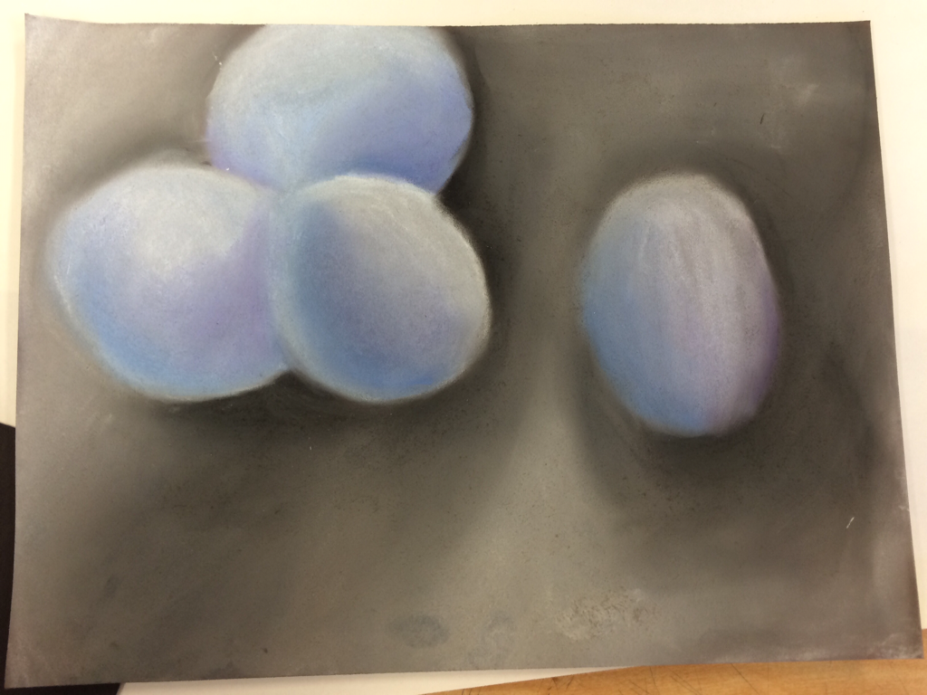 For this assignment we had to take a picture of eggs with a good light source and draw/color it using chalk. We had to use a definite color scheme for the eggs and background (ex: warm, cool, & neutral colors); I chose to use cool colors for the eggs and neutral colors for the background 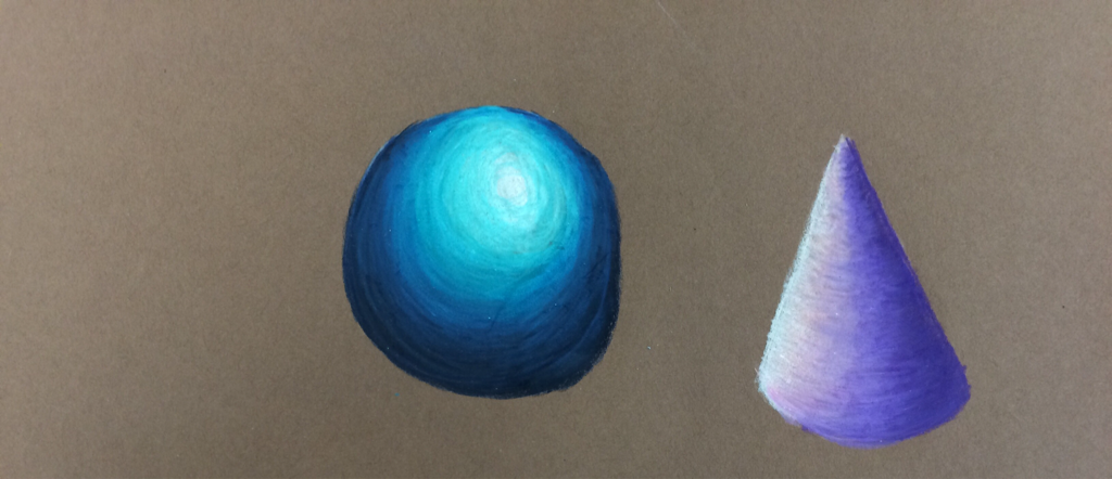 Back when we were learning how to use prisma color pencils we practiced shading by drawing 3D shapes with color pencils by picking 4 colors (including white) to draw them with without using black. for my (*cough* slightly deflated *cough*) sphere I used dark and light blues for my cone i used some purples and pinks. 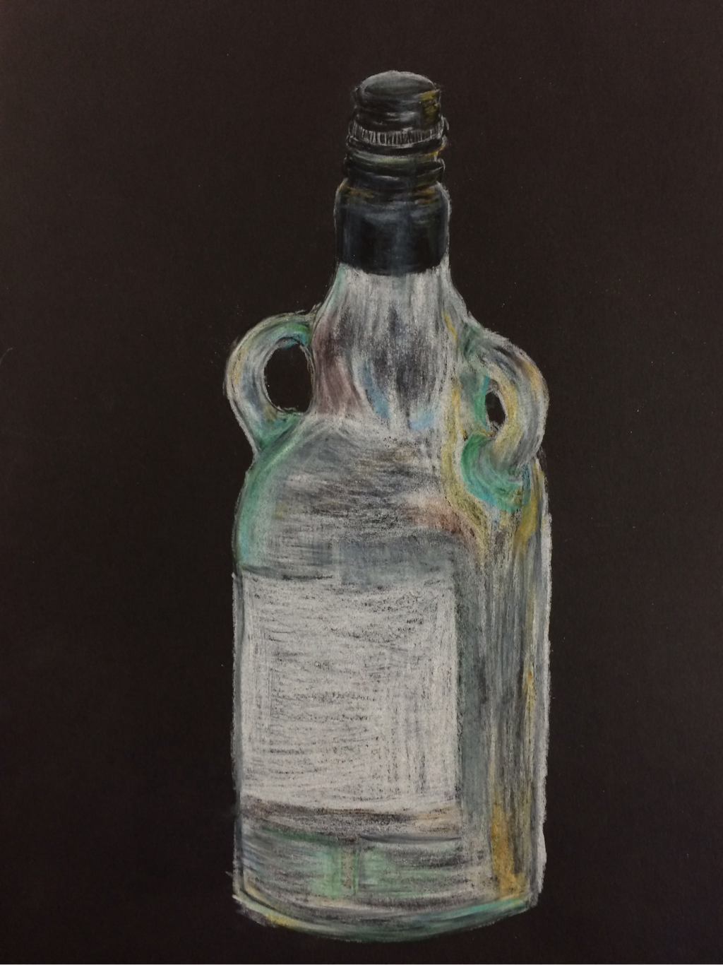 Another thing we did for color practice was drawing a glass bottle from real life with prisma color pencils. I never got to finish it but this was really fun to do! I tried my best to get all of the colors I could see in the bottle from the different light sources.
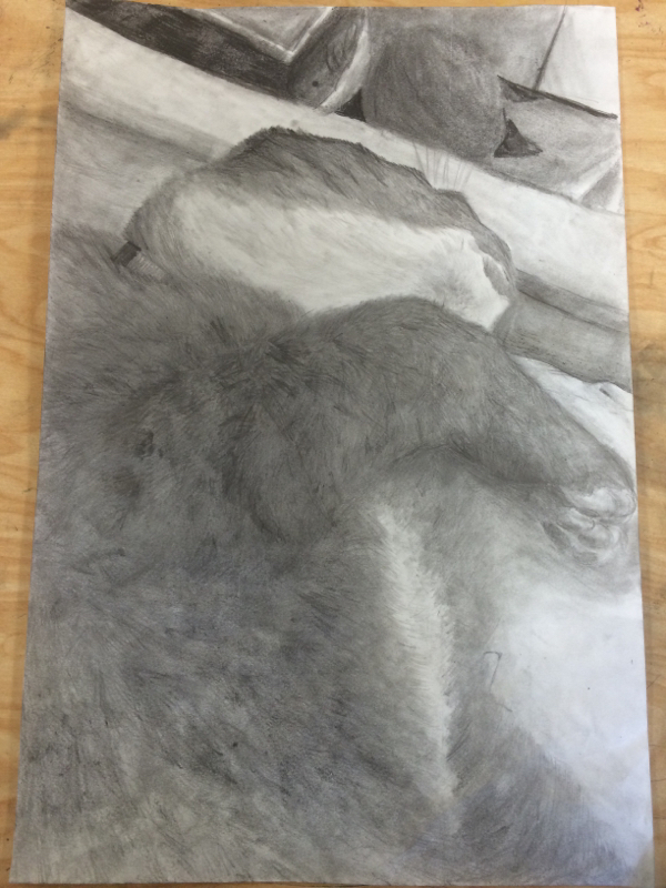 In this project we had to pick a picture we took of something with an interesting perspective and shade it using pencil. At first I really didn't know what to do for this project so out of desperation for inspiration I just took some pictures one of my cats while he was sleep-purring because I thought it was pretty cute. He was originally one of the stray cats that liked to hang around my neighborhood. During this summer I kept seeing some stray cats walking around in my backyard so I started leaving food out around my backyard. After about a week this little guy comes up to me and starts meow-screaming and rubbing up against me and demanding attention. We ended up adopting him a few weeks after that. He's now my indoor/outdoor cat who's really sweet and loves to have his tummy rubbed, sleep all day, and basically scream all night.
Okay I think I should start talking about the project now (heh whoops) So at first when I decided to use this picture for the project I was kinda iffy about doing fur because I'm not very experienced with it and it's a weird texture (for me at least) to draw. I am pretty happy with the way it turned out, mainly the fur direction on and around the legs! Although, I feel like the stomach came out a little weird, I think I may have shaded the area around there a little too much. The background shading isn't very good either in my opinion. The plank at the end of the bed looks weird perspective-wise as well which I wish I knew how to fix. But overall it turned out pretty great considering the fact I lost a lot of my drawing pencils and had to stick with one or two of them to do this project. I tried my best to get the fur values correct and blend it to make it look fuzzy and soft and not like some weird porcupine thing. I also had to try to make sure that the legs didn't look blended together into one huge mega-leg. I also had to be careful that the shadows on the sheets didn't look like part of the cat's fur. Another hard thing about doing fur is making sure that the sketch outline on the cat doesn't overlap or show through the fur, making it look like an outline. I tried to make sure to outline the cat with fur to show that it still stood up. Like you don't want it to stand up too much in certain places so you have to shade/draw it in a certain way, I'm not sure of a good way to explain this. |